Friday, 29 November 2013

Woodland Stream Concept

in my woodland environment I wanted to have some streams running from a poll of water near the centre of the small island when I was playing sky room I saw how they had made their own version of the stream using particles or possibly a flat plain that had a moving texture on it with no collision this is possibly what I could do in order to make my own streams in my own woodland environment.


below is the drawing of how I hope to implement the stream in the woodland environment showing the three stages of one texture being the bottom another texture with rocks and then the final texture of the moving water.


below is a birds eye view of the trees on the island removed and my attempt at playing around with particles to make the stream as you can see it is not very realistic but this was just a test to see if it could be done and from what I learnt from doing this is going to be a lot harder than I thought it would be.


herebelow is a close-up of the stream moving through the small island this is a simplified version of what I hope to have in the end.


Woodland Terrain Building (Show)


the third environment in which will show my organic woodland skills as you can see below is the basic layout of the environment which I which to achieve the area which the player will be to walk in is an island in the centre of the picture trees around the edge of the small lake of their as athletics.


below is the area where the player would start in the environment from entering from the warehouse through the telephone box portal to another telephone box which can be seen in the picture below.


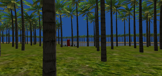
here is another picture looking back at the starting point in the environment of the trees these palm trees will not be in the final instalment of the environment but I added these in to give the understanding of the density of the trees and see what it would look like


Thursday, 28 November 2013

Entrance: Warehouse 2

Here I was looking at the basic framework of the warehouse which would be called the entrance this will be the portal and gateways to the other three environments 

to the left is the finished pillar which is made up of the parts made to the right I really wanted to the player to get the feel that this really was a warehouse using light metals in order to achieve maximum space.


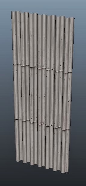
To the left and right are variations of corrugated iron that I would like to use as part of the main wall of the warehouse.
below is the finished wall the top of the wall has areas which would be full of glass which will allow the light is shining and give the sun rays affect their time looking for which I was showing in the research images in the previous post this wall will be copied and pasted along in order to make the warehouse.


Entrance: Warehouse 1

for the player to move around the environment I chose the telephone box in the previous posts but I wanted a main room which would hold a telephone box with the originally four worlds which was then changed by my decision to 3 in order to incorporate three windowed side of the telephone box

From this I decided to choose a warehouse which would be entirely empty apart from the telephone box which would be in the centre of the room I also really wanted to have the effect of the picture below with the light shining from the top windows which would give the warehouse light


below are two images that really get a point across of what I want the warehouse to look like with the sunshine shining into a dark warehouse which would contain the telephone box


Tuesday, 26 November 2013

Entrance: Telephone 2

in order to make the telephone box to make the roof I decided to take a sphere and delete half of it and then used Booleans > Difference in order to get the unique shape the telephone box  in the model.


below I have added in the box which would contain the word telephone as part of the sign including the Royal Crown which can be seen as a very small box in the top right-hand corner of the picture.


below is the window that would occupy three sides of the telephone box the other side will just be blank this would hold a telephone in real life.

below is a finished product with all the detail added and the colours this is what the telephone box will look like in my game.

Entrance: Telephone 1

looking at the four environments I decided they needed to be a way of being able to interact with them I did look at possibly using a police box similar to that of Doctor Who but this would have been seen as a bit cliche so I decided to use the British icon the red telephone box below are some research pictures.


Here I was looking at variations of colour with the green and blue below.


Below is one of the old versions of the telephone box that would eventually evolve into the one we know today.


And the reason why I chose the British telephone box is near where I live in Kingston there is a sculpture which can be seen below in the picture.


Monday, 25 November 2013

Steampuck Assets: Steam Arm (Update)


I had previously made what I called the steam on but I didn't go on to add more detail and finish it this post is an update of the steam on wherever added in a metal support structure as well as the Pistons that would pump the oil or water below are the steps I took in order to make these updates and I also updated the animation to have the pistons pumping up and down with the stop frame animation at the bottom of this post to help understand what it will look like when it is working I'm currently in the process of texturing what I've added


Sunday, 24 November 2013

Steampuck Buildings: Dam


In the area where I decided to add a dam I also wanted pipes falling down this down as some sort of sewage run-off and I thought this would add a real industrial feel to the environment and help immerse the player.


Below is a small gap which allow the player to go from one side of the environment and the other there will also be other bridges in my environment to help the player across the environment


Criticism: I still need to add grime and Mark to this down as it looks to clean and also I need to look at the texturing of the pipes as it is obvious there the same texture due to the tiling effect is not working so well